.png)

Every developer using AI coding tools has lived the same moment. You prompt Cursor for a landing page, and out comes a purple-to-blue gradient, Inter type, a shadcn button, and three evenly-spaced feature cards. The layout works. The code compiles. The design is forgettable. With 92% of U.S. developers now using vibe coding practices, that sameness is multiplying across the web in 2026.
The problem is not your prompts. The problem is your process. AI models are trained on millions of average interfaces and, when asked to imagine, return the statistical mean of what they have seen. This guide unpacks a five-phase workflow — drawn from Claude's official frontend aesthetics guidance and current vibe coding practice — that shifts you from generic AI output to pro-level, reference-driven UIs. You will learn why AI UIs converge, the core thesis that fixes it, and the exact phases that move you from slop to ship-ready.
Why AI-Generated UIs All Look the Same
AI-generated UIs converge because large models are statistical machines. Trained on the public web, they absorb millions of average interfaces — most of which use Inter on white, accent purple, and default component libraries. When you prompt with only text, the model returns the center of that distribution. Unremarkable is not a bug. It is an average.
The core thesis is simple: AI copies amazingly, it imagines terribly. The fix is not a cleverer prompt. The fix is feeding the model something concrete to replicate instead of something vague to invent. Reference-driven generation consistently outperforms pure text prompting because you replace the statistical mean with a specific target.
A quick diagnostic: your UI is probably slop if it contains any of the patterns in the left column below. The right column shows the pro-level choices that actually differentiate your product.
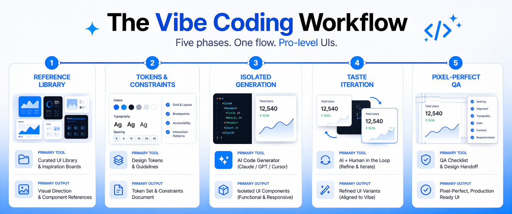
Phase 1: Build a Reference Library Before You Prompt
Pro-level UIs start before the prompt. Before you open Cursor, collect five to ten concrete visual references that match the vibe you want. Screenshots of real products outperform mood boards of abstract inspiration because the AI can parse them directly and reproduce specific patterns.
Categorize each reference by the design dimension it represents: typography, color, layout, or motion. Drop them into a /design-refs/ folder inside the repository. Most modern AI coding tools can read image context, so the references become part of every prompt you write. Specificity is what wins here. "Modern SaaS" is useless. "Dense, monochrome typography like Linear's changelog" is actionable.
- Mobbin, Godly, Land-Book, and Dribbble for product-grade screenshots
- Your own brand assets, existing screens, and design tokens
- Competitor UIs that represent the ceiling you are chasing
- One or two aesthetic outliers to push the model away from the mean
Phase 2: Prime the AI with Tokens and Constraints
Tokens beat prose. A design system defined in CSS variables — color, spacing, radii, typography scale — gives the AI a rulebook it cannot easily ignore. Include the token file in every generation context. Load and document fonts explicitly so the model does not fall back on Inter by default.
Pair your tokens with an explicit avoid list. Name the defaults you refuse to ship. According to Claude's guidance, you should call out overused choices such as Inter, Roboto, Arial, purple-on-white gradients, and cookie-cutter component patterns. Then commit to one decisive aesthetic: pick a distinctive font and use it with conviction, choose a dominant color with a sharp accent rather than a timid, even palette, and use weight and size extremes — 100 against 800, size jumps of three times or more — to create visual tension.
Phase 3: Generate in Isolation, Then Compose
No single AI tool is best for everything. Match the tool to the phase, and isolate design dimensions instead of asking for a perfect UI in one shot.
Isolated prompting is the underused technique that separates amateurs from pros. Ask for typography only. Lock it when it is right. Then ask for color only, against the frozen typography. Then motion. Then the background treatment. This pattern prevents the "fix one thing, break three" loop that makes vibe coding feel like whack-a-mole.
Phase 4: Iterate on Taste, Not Features
Once the structure is right, your work becomes qualitative. Review each iteration against the references you gathered in Phase 1 — not against your prompt. If the output does not resemble the references, the AI needs more reference data, not louder language. Avoid the phrase "make it look better." That prompt returns the AI to the statistical mean.
Ask for one refinement at a time. Tighten vertical rhythm. Replace the accent with a higher-contrast tone. Add a staggered entrance animation to the hero copy. Keep a taste log as you work — note which refinements moved the design and which did nothing. Over weeks, those notes become permanent upgrades to your tokens, your avoid list, and your workflow compounds across every project your team ships.
Phase 5: Pixel-Perfect QA and Accessibility
Pro-level UIs feel finished. Capture screenshots at every breakpoint, in both dark and light mode, with realistic content lengths. Run a visual diff against your references to catch drift in spacing, color, and typography. Small regressions accumulate silently during long vibe coding sessions, so this pass is where polish is either earned or lost.
Accessibility is not optional. Contrast ratios should meet WCAG 2.1 AA minimums, focus states should be visible for every interactive element, and motion should respect the prefers-reduced-motion media query. Modern AI coding tools will implement these checks if you put them in the system prompt and the token file. A UI that fails accessibility is not pro-level, regardless of how beautiful it looks on your monitor.
Conclusion
AI slop is a process problem, not a prompting problem. Statistical averages produce statistical designs. The fix is a disciplined workflow — a reference library, token-driven constraints, isolated generation, taste iteration, and a pixel-perfect final pass — that replaces vague imagination with concrete replication. The teams shipping agency-quality UIs in 2026 are not prompting harder. They are building systems that make great output the default.
Start on your next project. Build a /design-refs/ folder before you write a single prompt, pick one distinctive font, and name the defaults you refuse to ship. For teams operationalizing vibe coding across product and engineering, Crewscale helps structure workflows, tooling, and talent so pro-level UIs become repeatable — not accidental.


